Over the past couple of weeks, Google has been spotted introducing some interesting changes to the look and layout of its search results pages.
The first, as we reported in our round-up of key search marketing news on Friday, is that Google appears to have increased the length limit for title tags in the SERPs to around 69-70 characters.
Long title tags being tested again in the SERPs. Seeing 69 and 70 character results today. pic.twitter.com/esiKTctV96
— Ross Hudgens (@RossHudgens) May 6, 2016
//platform.twitter.com/widgets.js
Title tags on mobile have lengthened even further, some now clocking in at a whopping 78 characters, giving rise to a bit of a dilemma for SEOs wanting to optimise for both desktop and mobile.
Featured snippets have also grown in size, while descriptions now seem to be able to fit a larger number of characters onto one line, although the overall length of descriptions appears to be staying the same for the moment.
Meanwhile, Google is also conducting some A/B testing of different link colours, in a move reminiscent of its infamous “fifty shades of blue” test in 2009. Some users have noticed Google trialling different shades of blue in their search results, while others are protesting a change in link colour from blue to black.
Hoping that @google change the colour of links back to blue soon. These black links are making me sad. ☹️
#Google pic.twitter.com/yH4SRJbbpj
— D-J Gordon (@iamdjgordon) May 8, 2016
//platform.twitter.com/widgets.js
So what do we know so far about the new changes, and what impact could they have on SEO if they’re here to stay?
Extended title tags, descriptions and more
The longer titles in Google search results were first spotted by the sharp-eyed Ross Hudgens, who reported on Twitter that he was seeing title tags of 69 and 70 characters on Google.
While it’s still not confirmed whether the longer titles are a test or here to stay, at the time of writing (nearly a fortnight on from Hudgens’ tweet), I’m still seeing title tags as much as 68 and 69 characters long in search results for Google.co.uk.
70-character title tags were once the norm on Google, until Google increased the font size of titles from 16 pixels to 18 pixels in 2014.
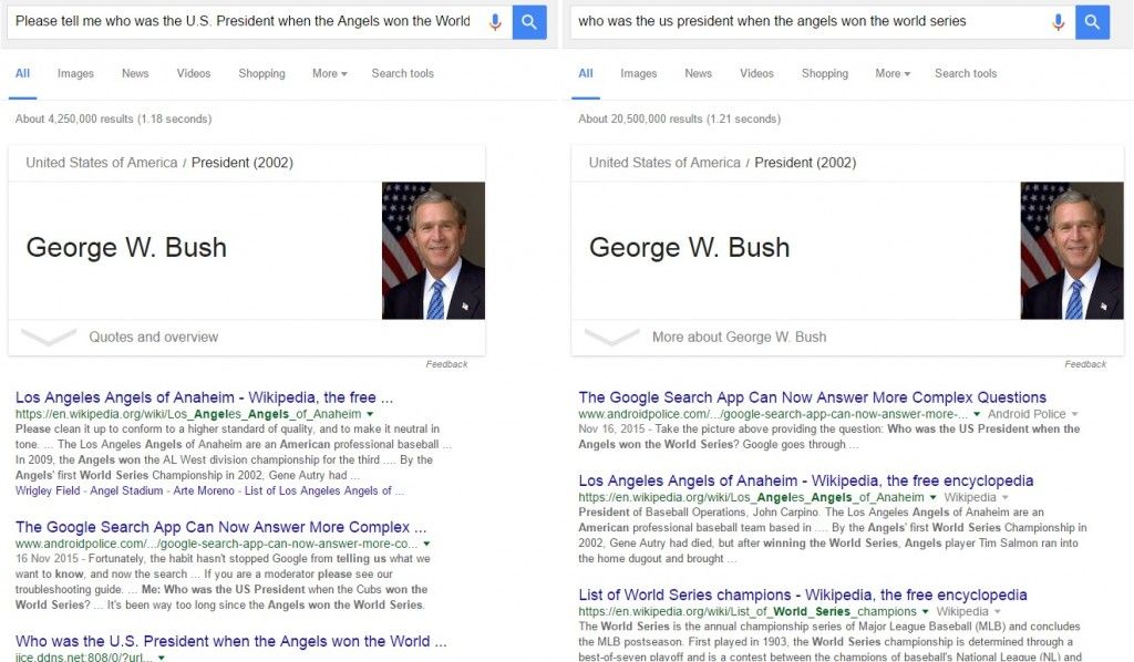
After that, the optimum length for title tags was between 55 and 60 characters. But since Google did away with right-hand-side ads on the SERP earlier this year (possibly with the eventual goal of widening search results in mind), it has had a bit more width to play with.
 Then and now: the old style of search results, left, versus the new, right
The SEM Post reports that altogether, the width of Google search results has increased from 500 to about 600 pixels wide, decreasing the space between results and the Knowledge Panel on the right-hand side by 5 pixels to make room.
It’s important to note that pixels, not characters, are the measurement that Google actually uses for search results and title length. We use characters as a more practical measurement, which is why character limits can only be an approximation, because characters like ‘w’ take up much more pixel space than characters like ‘i’ or ‘l’.
It’s not just title tags which have been affected by the search results widening: meta descriptions are also being given more room (about 100 characters) on each line, and in some cases displaying three lines of description instead of the usual two, which is a huge change.
However, Google is still cutting many of them off at two lines and around 150 characters, meaning it’s probably too early to start rewording your meta descriptions just yet.
The width of featured snippets has also increased from 556 pixels wide to about 645 pixels, while the height has decreased by about 30 pixels, leaving the same amount of text within the box but also giving more room for title tags.
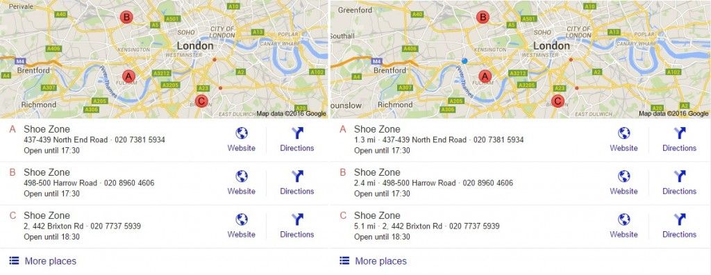
Finally, the three-pack of search results that appear at the top of the page when you make a local search has also widened to the same width as featured snippets while keeping the same height, allowing Google to add in a little more detail about the locations of local businesses.
 Left: the old ‘map pack’ of local search results; Right: the new, wider map pack
Meanwhile, on mobile…
Google’s SERP changes don’t just apply to desktop. The length of mobile title tags has reportedly increased to as much as 78 characters, putting them at a couple of keywords longer than the new title tags on desktop.
The change on mobile was first reported by Jennifer Slegg on the SEM Post a couple of days ago, although interestingly, I have a screenshot from April showing a search result with a 76-character title tag – which might indicate that I was part of one of Google’s famous “1%” tests in which it trials a new change with just 1% of its users.
 A search results screenshot taken on 25th April
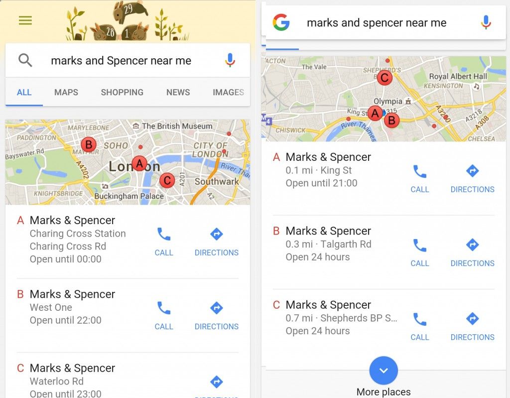
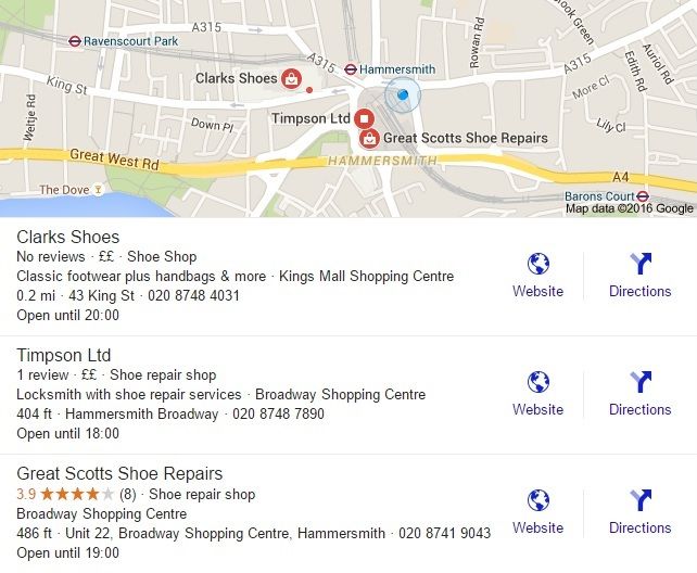
The three-pack of local search results on mobile also seems to have changed a little, at least since this screenshot that I took back in February, with Google choosing to include ‘distance from you’ information even at the expense of showing address details, possibly to provide consistency with the level of detail that desktop search now features.
What could it all mean for SEO?
I should stress first of all that none of these changes are confirmed to be permanent, and could revert back or change further over the coming weeks and months as Google refines its plans for the SERP.
It’s definitely too early to start altering your strategy based on what has been reported so far, especially as there are a lot of different changes being reported to different extents by different users.
But there’s no harm in considering how they might affect SEO, especially if these changes are any indication of what Google has in store for the future.
The most immediately obvious benefit of longer title tags and descriptions is more room to fit in keywords. While this is true, it’s also 2016, which means we can do a lot more interesting things with the extra characters – after all, it’s not just about keywords any more.
 Longer title tags and descriptions would give SEOs more leeway to use long-tail keywords.
Image by Dr. Ron Matson, available via CC0 (public domain image)
The first is that longer titles and descriptions would allow more room for long-tail keywords, three or four-word phrases that tend to indicate that searchers are closer to taking action or making a purchase, making them extremely valuable for marketers.
Similarly, the increased room in search results would give website owners more opportunity to use natural language in their titles and descriptions.
Natural language queries are search queries that use full, everyday language instead of short, disjointed keywords. They are becoming more common as voice search is on the rise and search engines are increasingly able to interpret specific, multi-part queries.
In theory, SEOs should adapt to this trend in order to give their websites the best chance of ranking for natural language search queries, but with a limit on how much will fit on the search results page, this is easier said than done.
Extending the length of titles and descriptions might be Google’s way of acknowledging this and adjusting the SERP to allow for it.
Finally, another benefit of longer title tags is that in some cases, it can make room for brand names at the end of a title, which is useful for making sure your brand stamp is on a search result without necessarily having to sacrifice any valuable content.
The increased width of featured snippets probably won’t make big difference as long as the amount of text within stays the same, but they’re still an excellent way to leapfrog your search competition if you know how.
Meanwhile, the wider map pack could be great news for local SEO, as it gives enough room to display short descriptions plus precise address details, distance (at least on Google.co.uk – I’ve noticed screenshots from Google.com don’t appear to have this feature) and phone number, all without truncating.
The new length difference between mobile and desktop title tags probably presents the most interesting challenge for SEOs. There has always been a bit of a difference in the way that title tags display on desktop versus mobile, with mobile title tags displaying across two lines instead of one line on desktop.
But if the longer title tags that we’ve been seeing on desktop and mobile both become hard changes, then many site owners will have to make a call: optimise for desktop, or for mobile? Or try to find a middle ground?
Ultimately it will depend on context: the type of business, the information that needs to be included in the title tag, and the types of customers that the business most wants to cater towards. A business with primarily mobile traffic might decide that it’s worth sacrificing a bit of readability on desktop in order to improve their chances on mobile.
There’s also the possibility that more website owners will choose to spin off their mobile presence into a separate site – m.example.com – instead of simply employing a responsive design for their main site, in order to have the best of both worlds.
Paint it Black
Last but not least, we have the news that Google has been testing different link colours on some of its users, with searchers reporting seeing a different shade of blue in their search results, as well as –much more outrageously – all black links.
Google is A/B testing different shades of blue on me. pic.twitter.com/PKf0TIyo1Z
— Rob Price (@robaeprice) May 9, 2016
//platform.twitter.com/widgets.js
My google links have turned black, They look horrible. Please turn them back to blue #google pic.twitter.com/hbF5lSkRpS
— facelessloser (@facelessloser) May 8, 2016
//platform.twitter.com/widgets.js
Instead of the usual purplish colour to indicate a previously visited link, the black search results are reported to turn a lighter grey when clicked on.
Setting aside the depressing visual impact of an almost-all-black results page, Google’s colour change experiments have some implications in search accessibility for users who are colour blind or have low vision.
Back in 2014 when Google removed the underlines in hyperlinks for its search results, leaving colour as the only visual clue as to which text was a link, Adrian Roselli wrote that: “Google misses the mark [for accessibility] in that the blue hyperlinks don’t have sufficient contrast with the rest of the text on the page.”
The darker blue text that Google is trialling in some places is an improvement on this, but the black link text that has caused so much upset comes with an additional set of problems.
With the exception of URLs just below the link text, which are still green, all of the text on Google’s SERPs is the same colour, with no other visual cues to distinguish links from regular text. Roselli explains why Google’s changes to the SERP fail accessibility guidelines on multiple levels:
“By dropping underlines, Google already ran afoul of Success Criterion 1.4.1 (which is only Level A) which requires something other than color to be used to convey information (such as the presence of a link).
By making the links the same color as the surrounding text, it now pushes that failure even further by not providing a 3:1 contrast ratio between the links and the surrounding text (which is outlined in Techniques for WCAG 2.0 as item G183).
Again, please don’t follow Google’s lead.”
The impact of this change, at least on the black SERPs that Google is trialling, could manifest in decreased click-through rates from users who find the new colour scheme visually confusing – or who find the new black links too depressing to click on.
Seriously Google this black links thing is killing me it's like the guy from Bauhaus is wailing all my search results at me
— Gregor Stuart Hunter (@gregorhunter) May 9, 2016
//platform.twitter.com/widgets.js


No comments:
Post a Comment