
![]()

If you think social media is a big deal now, you’ve seen nothing yet. Social media is poised to take over the world, or at least it’s heading in that direction.
By 2018, projections are that some 2.44 billion people will be using social media in one way, shape or form. That’ll be about one third of the world’s population.
Yes, indeed, whether you’re talking about Facebook or Twitter, LinkedIn or Instagram, social media user sizes are huge.
You? Not so much. You’re just one lone brand, personal or professional, in a vast sea of accounts, each and every one of which is trying desperately to stand out among a cacophony of content.
With the half-life of a tweet less than a half hour and complex, ever-changing algorithms on most major channels undermining reach and engagement, marketers who don’t have to work harder than ever to use social media effectively are few and far between.
Unless whatever it is they happen to be marketing has got it all going on like Lokai.
Even if you haven’t heard the name of this brand, chances are you’ve seen the product being worn on someone’s wrist.

It’s a simple, silicone bracelet that has been the latest rage and fashion accessory of famous athletes, celebrities and everyday people like me and you for the last few years.
And while this brand may not have to work as hard as others to succeed on social media, its popularity may have as much to do with how well it works the crowd – both online and in real life – as it does with how lucky it is to have such an outstanding product.
Here are three things any marketer, B2C or B2B, SMB or enterprise-level organization, can learn from Lokai’s activities on social media and be a standout themselves…
People are curious and inquisitive, if not downright skeptical. There’s a backstory to every product or service that your audience doesn’t just want to hear, but needs to hear.
It’s this story that makes your brand more genuine, unique, credible and believable. Trust is something that is earned, not given.
No brand is born overnight. In Lokai’s case, it was the brainchild of young entrepreneur, Steven Izen, who while still a student at Cornell University, came up with the idea for the bracelet.
Inspired by his grandfather’s Alzheimer’s diagnosis, the black bead contains mud from the Dead Sea, the lowest point on Earth, to represent the sadness Steven felt at the time. The white bead carries water from the highest point on Earth, Mount Everest.
The name of the bracelet is a takeoff on the Hawaiian word, Lokai, which means unity and the combination of opposites, the hopefulness we feel when things aren’t going well and the humility we should exhibit when we’re on a roll.
Do you have a story to tell to your own audience? How would it begin? Where would it end?
Modern marketer extraordinaire Seth Godin wrote about it in his 2004 book, Tribes. Speakers at a GaggleAMP conference I recently attended at Bentley University preached about it. Popular rock bands have had them for years.
Whether you call it a tribe, a gaggle or a fan club, you need to build your own tightknit community of people who live, breathe and adore whatever it is you have to offer, people who like to talk amongst themselves about what makes your product or service so special, people who are unabashedly proud to show off whatever you have to offer to their own personal networks.
These are your very best customers, those who are going to gloat, advocate and evangelize on behalf of your brand.
Lokai has them in celebrities such as Justin Bieber, Ariana Grande, Cam Newton, Paul Wesley and Gigi Hadad – each of whom has been photographed wearing the cool, newfangled bracelets – in addition to literally countless others, who they celebrate and embrace on both their website here and on social media everywhere.
Who are your devotees and how do you reward them for their loyalty to your brand?

Many brands struggle to find any semblance of their own soul – if they even have one – never mind to actually use it to their advantage in their marketing campaigns.
Yet like sharing a good story, baring your soul for your audience to see can be especially good for business. Associating yourself with a cause worth supporting betrays the human, compassionate side of your business, the side that may appeal to your constituency as much as your products and services.
It shows you have a kind soul, if not a good heart, too. In Lokai’s case, 10% of bracelet sales’ net profits are “dedicated to giving back to the community through a variety of charitable alliances.”
Different, limited-edition colored bracelets associated with specific charities – such as Oceana, Make-A-Wish and The Alzheimer’s Association – are also rolled out from time to time, creating a strong sense of urgency around the buying process.
When all is said and done, cause-associated social media marketing can provide a big boost to sales, and certainly can serve as a win-win business model. What nonprofit organizations mean the most to you and your colleagues? How can you do well by doing good?
Today is the FINAL day to get the Shark Lokai and join us in preserving our oceans and marine life #sharkweek pic.twitter.com/XwysdUzjip
— livelokai (@livelokai) July 2, 2016

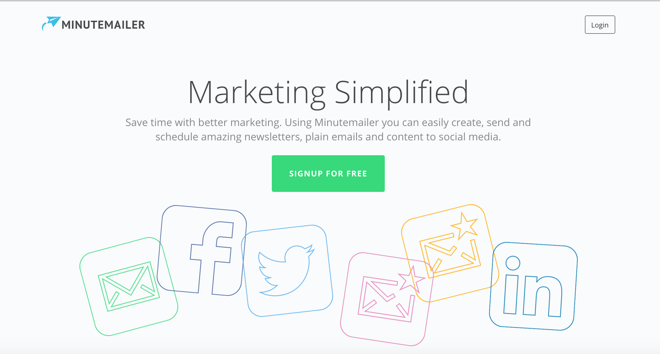
It’s easy to create a landing page to promote a product, or a service, but is it really conveying your message to boost conversion?
Landing pages can be a great starting point for a business to promote a new product, or a service, but it’s becoming more challenging nowadays to convince customers to trust you.
There’s an increasing online clutter that can make an landing page look spammy, but there are always quick fixes to improve conversion, especially when focusing on user-experience.
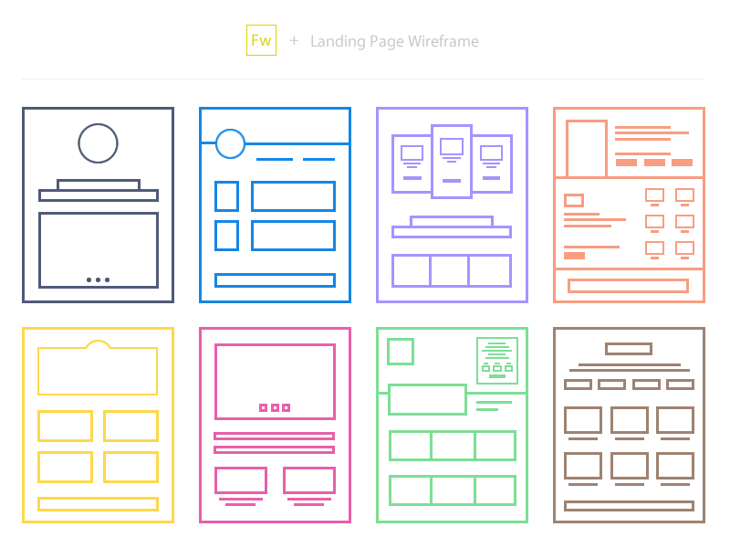
Image Source: Soumya Kanti Paul
Every landing page is focusing on a particular target audience, which means that it’s vital to grab their attention, keep them engaged and eventually turn them into clients.
The sales funnel is becoming more difficult day-by-day as the competition is rising, so if a landing page is the introduction to your company, then you might need to use the following tips as a checklist on how UX can improve your conversion rates.
A landing page’s design should be clear and minimal, in order to avoid any confusion among visitors.
An appealing and simple design may lead to more impressive results than an overstuffed page, especially if it manages to serve its purpose.

This should be your first step when creating a new landing page. Before start its design and its formatting, think of your target audience.
All these questions (and even more) can help you understand your target audience and create the perfect landing page, depending on their needs and their expectations from your company.
Even if they haven’t heard about your service before, if you are able to analyse their online behaviour, then you’re already on the right track to create an effective landing page.
Don’t underestimate the importance of content when creating a landing page. Visual content may prevail in the online world, but written context will always be powerful. There’s no need to use jargon, or complex language that can alienate users.
Once again, think like a user, shape the message in your head, read it out loud and aim for clarity.
If you can’t explain your concept to your users in its simplest way, then you probably need to reconsider your message.
Whether it’s a signup field, or a newsletter subscription, a user-friendly form is crucial for the success of a landing page.
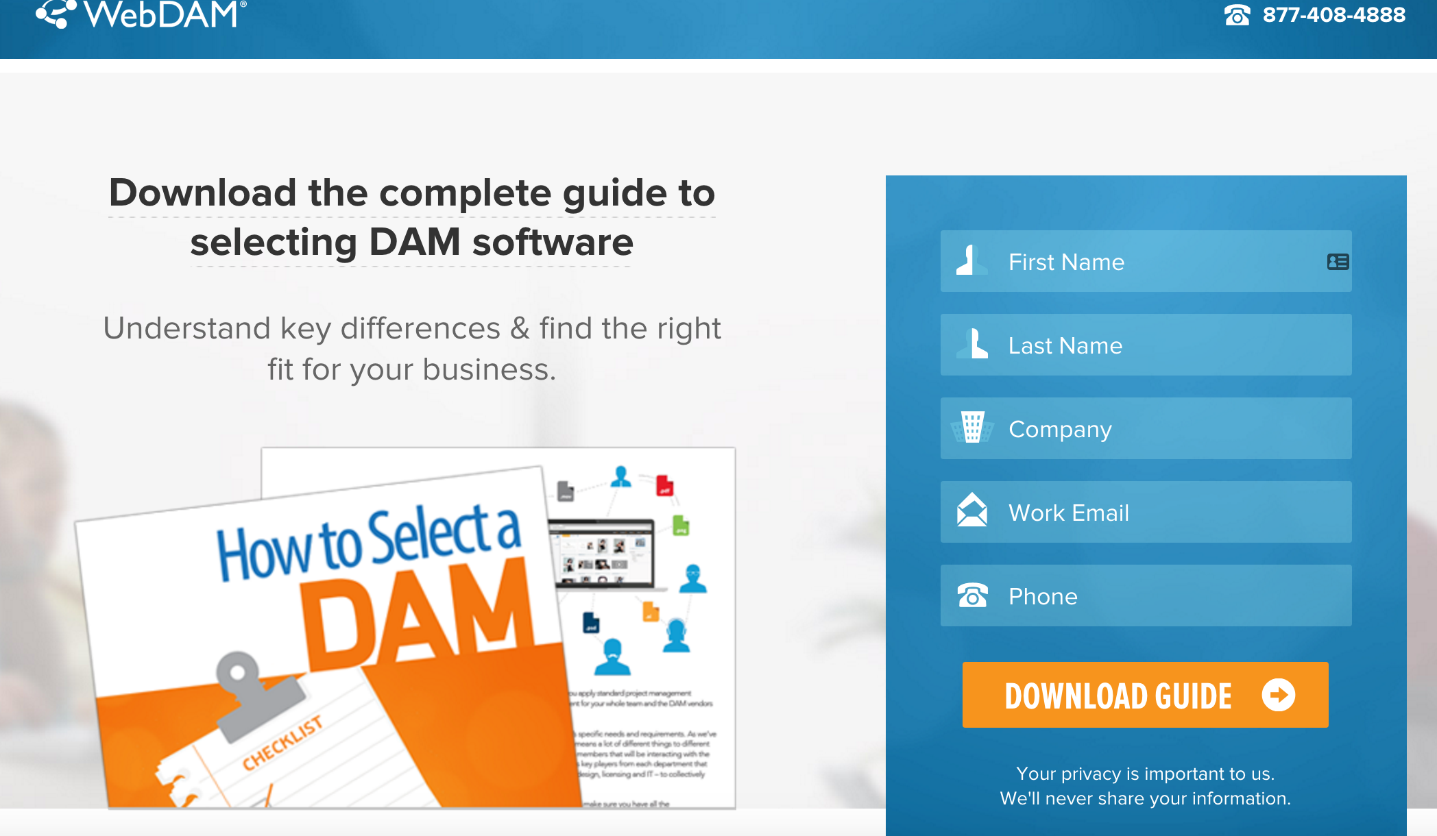
People are wary of sign up forms and giving out their personal details, so make sure that you’re only asking for what’s necessary. Find a reason to convince users to trust you, whether it’s a reward, or a highly appealing and relevant landing page, and return the trust with a quick and simple registration process.
Or else, you’re simply reducing the chances of increasing conversions with a simple mistake that could be avoided.

Your call-to-action should contain your message in the most appealing way, both aesthetically and functionally. It’s not always easy to achieve this without the proper testing before, so be prepared to experiment with the effect of colours, shapes, sizes, and fonts for your CTA.
Will you create a button, or will you focus on a form?
The emotional design of a landing page may lead to the strategical placement of the key message to the right area of the landing page, the one that a user may see first.
This can enhance the chances of turning the visitor into a conversion, while simple psychological triggers can help the process.
A landing page’s content should reassure the users of their safety, their values, their needs, their importance, their personality, or even their time.
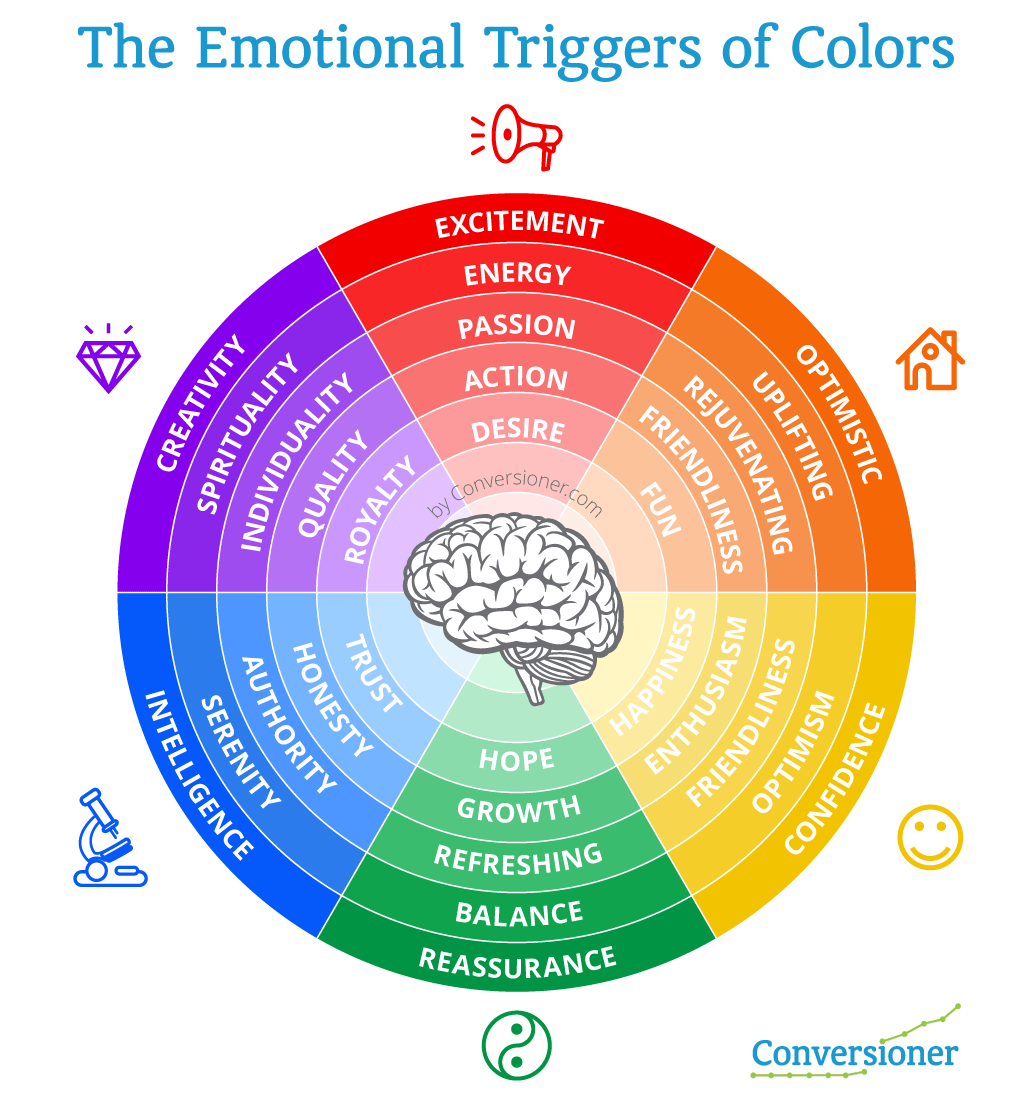
Even the use of colours may affect the user’s psychology and this is another reminder on why we cannot underestimate the needs of the user when creating a landing page.
Visual content can significantly enhance the appeal of a landing page, provided that it’s meaningful and it is supported by the right text.

There’s no need to fill a landing page with stock images just to make it more visual. Once again, simplicity is appreciated by customers and visual content may only increase the conversion rate when it manages to:
Mobile optimisation should be a priority for every landing page, and 48% of users who visit a non-mobile optimised page take it as lack of interest from the business.
As mobile users keep increasing, 83% of them now ask for a seamless experience across all devices, considering it very important for their whole impression of a page. More and more users access a page through their mobile phones, which means that they should indeed access the same browsing experience among any device.
What if a user accesses your landing page through a smartphone to learn more about your product and has trouble finding the CTA due to the poor mobile design?
Mobile design is all about focusing on the user and UX is more important than ever, in order to deliver the best results, leading to an appealing and effective page.
After all, Google is serious about its mobile updates and it’s planning to include page speed as a factor on its next update, which means that optimisation is becoming more important, aiming for simple, clear, light pages.
If you’re still unsure whether your landing page is passing the test of mobile optimisation, then Google may help you with this tool.
If you need to learn more about mobile optimisation and how it affects a site’s performance, feel free to read more.
People visit a landing page to learn more about a product, or a service. However, the visit won’t last long if you don’t convince them about your actual value.
Direct selling and its relevant language is not working online, so it’s time to educate your audience about your service and how it may benefit its target users.
Each landing page and its product should aim to solve a problem and what’s more important is that it needs to explain how it is actually solving it.
If the message isn’t clear both on the offered solution, but also on its method, then the conversion rate won’t reach the desired levels.
Whether it’s a short explanation with bullet points, a video, or a graphic, your landing page should try to appeal to its target audience by presenting its value and the reasons they should sign up.
There’s no need to include a navigation bar to your landing page, at least not if you’re trying to turn the visitor into a client.
A study back from 2013 measured that only 16% of landing pages were free of navigation bars (hopefully this has been improved lately), although it has been tested that the presence of a navigation bar affects the conversion rate.
There’s no need to make a user’s visit shorter or complex with the use of an additional menu, so maybe it’s time to remove navigation and test the results.
Distractions can be found everywhere and as our attention span gets shorter, it is becoming more difficult to focus on a single page for more than 5-10 seconds.
This makes it more difficult for a landing page to grab a user’s attention, to the extent that the conversion is achieved and that’s why the page’s design should leave out as many distractions as possible.
Whether it’s a banner, a pop-up, a menu, or an external link, make sure your page’s design is not blocking you buying funnel and your goal to turn visitors into customers.
If you want to be inspired about your next landing page, here are some good examples we came across from many different fields.
These could serve as real-time examples for the tips above, while they are also offering the right creative direction for all the purposes a landing page may serve.


Remarketing adverts are designed to remind people who have visited your website of what you sell, as well as reinforcing your brand, when they’re moving around the web.
Remarketing is also known as retargeting and according to PPCMode’s Ultimate Guide for Retargeting, “Most sites are only able to convert 2% of their visitors on average. With retargeting however you’re able to keep the interest of the other 98%”.
By placing a cookie on an individual’s browser, companies can track their audience’s buying habits around the web and then create adverts targeted to their interests.
The two key reasons why remarketing works are:
Below we take a look at the five key factors your remarketing adverts need to have to ensure you’re harnessing every potential opportunity for a conversion.
How relevant the products or service which is being remarketed to your audience is the most important aspect of a remarketing campaign.
By displaying highly targeted adverts, you are more likely to engage existing or potential customers so they click back to your website.
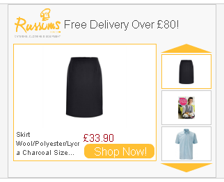
The simplest way to do this is to display the exact products your customer viewed on your website, in the remarketing banner.
This is known as ‘dynamic remarketing’ and in this example from catering equipment specialists Russums, the exact products I viewed on the website are included in the advert in rotation, with a ‘shop now’ button to encourage me to click.
Sometimes this goes a step further by showing customers who’ve abandoned their shopping cart what is in their cart and allowing them to continue to complete their order with one click.
You can set up different adverts for customers at different stages of the buying cycle. For example, once someone buys the product you have been remarketing to them, remove this item from the banner and replace it with a complementary product. If they bought a girl’s dress from you, for example, then show them a cardigan or matching shoes instead of the dress they already bought.
If a customer has already bought from you, then entice them back to buy more with a return customer discount, or alternatively, if a potential customer has viewed products on your website but not bought anything, then encourage them to convert with a new customer special offer.
Remember the golden rule of remarketing, the more targeted the advert, the higher the conversion rate.
Calls to action on your banners provide the push which gets visitors to click on your advert and visit your website.
As the aim of call to action buttons are to get people to click and convert, the copy you use on them needs to be persuasive. Buttons with very specific instructions work particularly well as they tell an individual exactly what they need to do next.
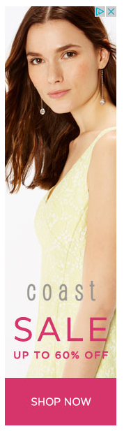
For example, this banner from Coast gets straight to the point with a clear offer (60% off sale) and call to action (shop now).
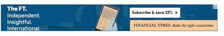
The Financial Times banner advert has an equally direct call to action button of ‘Subscribe and save 25%’ clearly outlining what action an individual has to take and what benefit they’ll get when they take this action.
This small space of around five words is the place where you tell your audience what you want them to do, ‘find out more’, ‘download free guide’, ‘sign up free’, ‘book now’ are all persuasive messages.
The less ambiguity the better with call to action buttons so avoid vague prompts such as ‘go’ or ‘click here’ or just using arrows on your button.
Your click through rate can improve dramatically by adding a time sensitive offer as your call to action – limited free trials, discounts and early booking incentives create a sense of urgency which can encourage people to click.
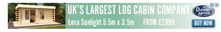
Calls to action such as ‘buy now’ for expensive products don’t always work as this implies a commitment to an expensive purchase by clicking the button.
This Dunster House advert is an example of this, as more enticing and less direct copy on the button would be more appropriate as even if someone has viewed the cabins before, they are unlikely to just ‘buy now’ for such an expensive purchase. Calls to action such as ‘explore the range’ or ‘discover your perfect cabin’ would be better options.
When it comes to colour – buttons which stand out work best for the obvious reason that they’re easier to see. The Coast button is a good example of this as the pink of the button contrasts perfectly with the pale background of the advert.
Text should be large and clear and there shouldn’t be too much of it in the box, a maximum of five words is a good rule of thumb to ensure your copy is informative and you’re not confusing or distracting people by trying to deliver too much information.
Not everyone who visits your website will buy online from you as they may choose to buy direct either over the phone or in person.
Seeing an advert for something someone has already bought will be annoying for them and pointless for you, as they’re unlikely to buy the same item again online. Limit the number of times someone sees the same advert and instead show complementary products.
Your adverts will have your branding on them so they will be constantly reinforcing your message, meaning they will be more likely to remember your brand when they’re ready to buy again.
Bombarding an individual with the same advert over and over again is akin to harassing them, which could reflect badly on your brand. To find the sweet spot to cap your adverts at for your customers, test different lengths and see which brings in the best conversions.
In many cases, showing an individual an advert for an item they didn’t buy three months ago is too late, unless you specialise in products with a longer buying cycle such as vehicles or B2B services like software and insurance.
If you’re dealing with everyday items, remarketing a pair of shoes, for example, to someone three months after they originally viewed them on your website is probably going to be too late. You can change your adverts to show for a more appropriate length of time by amending the ‘membership duration’ tab in your Adwords campaign.
Depending on your business, you may have very specific busy periods throughout the year. For example, if an individual purchased flowers from an online florist for Valentine’s Day then it’s worth retargeting adverts to them around other special occasions such as Mother’s Day.
You could set up specific Dynamic remarketing campaigns with Google ads to help you keep track and market to people who have visited or bought from your store to reengage them the following year.
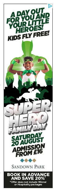
Time sensitive calls to action are another way to boost click through rates by utilising your advert buttons. Calls to action which encourage urgency give people a reason to act sooner rather than later and can therefore boost click through rates.
This advert from the Jockey Club promoting a family event at Sandown Park Racecourse includes a special ‘early bird’ offer of 20% off for advance bookings, as well as showing all the other information busy parents need to know about the event.
The tricky part of designing remarketing banners is that your design needs to reflect your brand whilst encouraging shoppers to click through and complete their purchase. Below are some considerations you’ll want to think about when designing your banners.
Whether you opt for static or animated adverts will largely depend on the message you want to convey and the design resources you have at your disposal.
A static advert is much easier to produce and upload to your search network, but it might not have the capacity to showcase your products or service in the way you wish, as it’s simply a single still advert, usually containing a logo, call to action button and an image.
It’s easier to tell a story and convey more complex messages with animated banner ads but it’s important to think about what your key message is though, as if it can be conveyed clearly with a static advert then designing a HTML 5 advert may not be worth it.
Again, this is why testing is so important!
Remarketing adverts should be clearly branded as the whole point of this type of marketing is to reengage with people who have already visited your website.
They are unlikely to reengage with your brand if they don’t recognise it. Often your company logo and colours will be enough for people to recognise your brand but also bear in mind how you want your brand to come across to customers.
Consider this advert for Jimmy Choo, this remarketing banner simply displays the brand name along with a scrollable selection of their products.
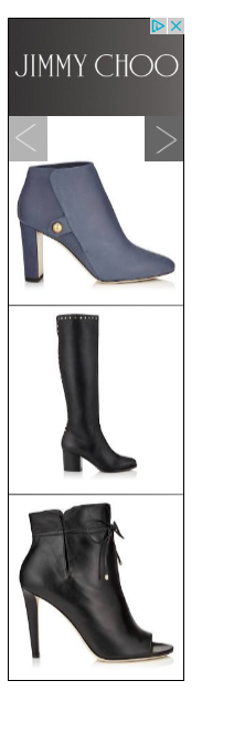
This simplicity works with Jimmy Choo as it is a global, aspirational brand, which means if someone thinking of buying from them they’re likely to be aware of the brand and prepared to pay a significant amount for a high quality pair of shoes, so subtle, smart branding is all that’s required to successfully reflect the ethos of the brand.
Compare this with this advert from Argos which includes the logo, an image of the product, sale information and a ‘shop now’ button.
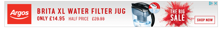
It’s much bolder, brighter and contains more information than the Jimmy Choo advert but again, it reflects the ethos of the Argos brand as an affordable retailer perfectly.
As with a regular PPC campaign, you should constantly test your remarketing adverts to ensure they are optimised for conversions.
Split test your adverts to find out which ones are most effective at converting.
Some areas to consider testing include:
Vigorous testing is the only way you will know what type of remarketing adverts convert best for your brand.
Simple tweaks to your remarketing adverts can boost your conversions and ensure your brand message is conveyed to your existing and potential customers.
By focusing on relevance and streamlining your comparing through testing, the higher your conversion rate will be from your remarketing adverts.

To get better search engine rankings or land on the first page results on Google in 2016, site speed and HTTPS were listed among the ranking factors.
Brian Dean of Backlinko conducted an experiment with 1 million Google results to determine which factors help web pages appear on the first SERP and I’ll be discussing two of those ranking factors here:
Every online business uses a hosting company and most of the time pay no attention to what kind of IP address was assigned to their hosting account, be it a “dedicated or shared hosting IP address.”
There are two types of IP addresses in the web hosting industry and they are:
Mind you, there are controversies around dedicated IP addresses for SEO and questions around whether a dedicated IP address would actually boost rankings.
The truth is, a dedicated IP address from your hosting company would not boost your SEO but increase website loading speed, which is a criterion for SEO (Google and Bing) in 2016.
So a dedicated IP can result in an increase in site’s speed which equals good SEO for your website.
The benefits of using a dedicated IP address can be found below:
Having a dedicated IP address for your hosting server would increase your website speed, provide enhanced performance and security (access to an SSL Certificate).
An SSL Certificate is required for ecommerce businesses and other online businesses collecting personal information from customers.
However to use an SSL certificate on your website you need a dedicated or static IP address.
An SSL Certificate is a security token used to protect private information traveling across the web. It provides security for customers and builds trust on the business with the presence of the lock icon or green bar.

The benefits of using an SSL Certificate is not limited to SEO, an SSL Certificate provides security for the website owner and trust from the website visitors or customer.
An SSL Certificate provides security through HTTPS for your customers and website which is a ranking factor for Google search engine resulting in better rankings in search engine results.
To get on the first page of Google’s search results depends on a lot of factors but you need a fast dedicated hosting server (John Stevens reviewed 27 hosting providers), an SSL certificate for security and trust for customers and search engines
Implementing any of the above should provide positive changes to your search engine traffic.

Pokémon Go may not even have a worldwide release yet, as it’s only available in US, Australia and New Zealand, but it’s rapidly surpassing WhatsApp, Instagram and Snapchat in terms of usage.
Over the past few days, we’ve seen several examples of brands using Pokémon Go as a jump off, and I’m sure there’ll be many more.
Not every mention was successful, so here we present the best and the worst mentions from Twitter.

Our favourite example comes from the Tennessee Highway Safety Office and it raises awareness regarding the increased dangers of playing while driving.

Whataburger in Texas and the Australian ME Bank were among the funniest and most relevant brand mentions we came across on social media, as they managed to skilfully blend their focus with the trend.
However, they were not the only ones:

If you’re playing #PokemonGO then you should know, or bookshop is full of them! Come browse and catch them all! pic.twitter.com/cGC42naQa3
— Waterstones Walton (@WaterstonesWoT) July 11, 2016
Well played, Amazon.
Because #PokemonGO https://t.co/OyZwxQGdmt pic.twitter.com/3BOvz9DGR2
— Amazon (@amazon) July 11, 2016
Just another reason to come by #FuzzysTacoShop today. Thanks for the report, @MatthewGrant10. #PokemonGo pic.twitter.com/lYWNOEZQPN
— Fuzzy’s Taco Shop (@fuzzystacoshop) July 11, 2016
When you just gotta catch ’em all. #PokemonGO is on at the Mall! pic.twitter.com/R2LZ9WtWOh
— Mall of America (@mallofamerica) July 11, 2016
Looks like the DZ house has a few new house mates! The #PokemonGO phenomena is happening here! #DZMonday pic.twitter.com/5PvXHmh1jo
— ΔZ UofL (@uofldeltazeta) July 11, 2016
Not only do our students hang out in the @uclaanderson Courtyard, #PokemonGO has taken over, too! #PokemonGoBruins pic.twitter.com/TFz9UjDlcr
— UCLA MBA Admissions (@uclaMBA) July 11, 2016
We think Pokemon are like trains you’ve gotta catch ’em all! We’ve got Psyduck in the office…. #pokemongo pic.twitter.com/4DebN8Pqzz
— trainline (@thetrainline) July 11, 2016
Sometimes a brand should think twice before posting about a trending topic, as the expectations are already high and the competition even higher.
Only refer to a popular topic if you can really support it and be relevant to your audience, or else your message will be ignored, and even worse, it may be used as an example in posts like this😉

The example above is not too bad, but it may be too direct for some consumers. If you had to target Pokémon users, it might have been a better idea to provide them free charging inside your shop, as a way to make them stay longer.
And of course, there are more examples of tweets that probably didn’t offer much of a value for the brands.
Countable: it’s like #PokemonGO except not really and it lets you contact your lawmakers and understand legislation: https://t.co/XXSNMQns7e
— Countable (@countable) July 11, 2016
Lure on the bike art outside Union Ladro! Come get your morning coffee & #PokemonGo
— Caffe Ladro (@LadroRoasting) July 11, 2016
Don’t forget to make a stop @7eleven and get your favorite drink while on the #PokemonGO –> 7/11 Day pic.twitter.com/5rGq0S9hLD
— Juan C. Cardenas (@GORealtorUSA) July 11, 2016
So if you can’t get #PokemonGO to work yet in the #uk.
How about give Tap Golf 16 a go….https://t.co/vsxuM0JJPw pic.twitter.com/ubnaMi5Wr3
— Ryan and App (@RyanandApp) July 11, 2016
Even if it’s not relevant for a brand, there is still a way to create appealing content for its audience, provided that there is the right connection.
Users will certainly appreciate a clever post, or a funny reference, but don’t expect that a popular topic can instantly boost the engagement of a post.
Some cases were not very successful, as they simply used a hashtag, or a reference to Pokémon Go to promote their own message, which usually doesn’t turn out to be very effective.
Make sure that the content you’re creating is a good fit for your audience and find ways to expand it or even discover new marketing opportunities.
For example, there is an interesting potential for local businesses to seize the trend of Pokémon Go and increase the business prospects.
Obsessed with #PokemonGO?! Our STL office is a Poke Stop and our KC office has one right next door!
#obculture pic.twitter.com/P6ypO5WTPd
— Osborn Barr (@osborn_barr) July 11, 2016
Some businesses are already trying to promote their presence on the game, and it actually seems like a good idea, provided that they’re okay with having people around that may not necessarily end up being customers.
Do not hesitate to join the popular discussion if you feel that your brand can benefit from it. However, whether brands are aiming to engage with their users or increase brand awareness, context can make a difference.


